Creating An Instagram Theme You Are Proud Of
Instagram has completely taken over the world of photography, which is such a blessing for us artists, because it is so easy and cheap (free, actually) to get our content in front of thousands of people in an instant. Having a consistent and visually pleasing feed is more important than you would think, because for most of us, it serves as an online portfolio and is usually a client’s first glimpse at our work. It also gives us the opportunity to demonstrate our preferred editing style, and allows us to show off the things that make us unique/differentiates us from other photographers. However, with Instagram, comes intense pressure, so it is important to find the balance between posting photos that simply compliment your overall theme, and posting photos that you really love. Finding this balance is what will ultimately result in a feed that you are truly proud of, plus you will save your sanity! With that, I’d like to tell you all a quick little story of how I came to love Insta, haaate insta, and then fall back in love with Insta again.
the vicious cycle
When I first joined the world of photography I had no idea what an “Instagram theme” or “ Instagram aesthetic” was. I posted whatever I wanted, at the time of day that I wanted, and I didn’t give a damn. I started to get pretty good at taking photos (or at least that’s what my mom told me) and felt empowered to post often. It was so simple and fun, and eventually led to making a little extra money doing something that I loved.
Fast forward a year or so, I decided to attend my first photography conference. As I said, I was getting pretty darn good, and the feedback I was receiving had me thinking, “I can really make a career out of this!” So, I walked my confident, happy little ass into the massive conference that I had saved up to attend, and was introduced to terms like feed, theme, color palette, algorithm, aesthetic, and so on. This is also where I learned how important it was to be consistent because, obviously, clients like to know what they're going to get when they book you. After attending the conference, I felt like my brain was so full of untold knowledge and new ideas. It was as if I had been taught every trade secret in the book, and was going to take the photography world by storm. During the remainder of the conference, I half-listened, and half dreamed up new colors, captions, and photo ideas to start incorporating into my decided theme.
^Me thinking about how awesome my brand was going to be.
After the conference several of us began passing around our phones and adding each other on Instagram and, as one does, I started playing the comparison game with myself and every other person there. As it turned out, everyone already had their themes perfected, they already had a perfect aesthetic, they already had amazing and unique photos. It all seems so dumb looking back, but I felt SO behind and embarrassed that I wanted to get up and leave the conference all-together. Up until this point, young Hannah thought she could build her brand overnight, and seeing how far along the other conference goers were was a harsh realization. At that point, I knew that I had a long long way to go, and left the conference feeling discouraged and uninspired.
*sniffle*
Fast forward a week or two, I was doing everything in my power to make my Instagram feed a perfectly themed work of art the way that those talented humans at the conference had done so well. I went through the vicious cycle that so many new artists experience -trying a new theme for a few weeks, hating it and deleting a bunch of photos, telling myself that I was being ridiculous/attempting not to care anymore, and then starting all over again. I mean, WTF? Instagram used to be this fun, therapeutic way to share my cute-sy photos, and now it’s some intense burden weighing me down. It wasn’t fun anymore, rather it was a task that, I kid you not, kept me up at night. Who in their right mind lets a photo sharing app keep them from SLEEP?! It’s safe to say I took Instagram a tad bit too seriously.
finding the balance
Fast forward some more, and somewhere down the line I had a revelation - No matter how hard you may try to make your Instagram as beautiful as humanly possible, you will never be happy with your feed if you are not proud of the photos you are posting. Write that 100 times on a piece of paper. Then 100 more times. It took a lot of time, but eventually I stopped caring so much about what my feed looked like and started posting photos that I truly was excited to share. So, If you’re feeling the way I did, (still do at times) here’s an exercise to help you achieve your own unique identity while maintaining that balance we discussed earlier:
Think about some of your favorite Instagram accounts to follow. In most cases, their feeds will have most, if not all, of these qualities:
Consistent photography style that allows you to recognize their work without even looking at who posted
An overall “color scheme”
Ability to convey what they love to do/photograph through their work
A good balance of busy/full scene images mixed with simple/closeup images
Professionalism mixed with personality
A sense of carelessness, but in a good way (it makes sense in my head, ok?) In other words, they don’t try too hard
Photos of the work they create mixed with personal posts
Hope Taylor Photography taught me that most, if not all, of these “rules” should be visible within the first 9-12 images on your feed, because almost everyone decides whether or not they want to follow an account based on a first glimpse. But remember, you want to make sure your feed conveys what you are all about. And guess what? Not everyone will follow you, and not everyone will like your feed aesthetic, and that’s ok, because at the end of the day what’s most important is that your brand represent you and what you love. Let’s look at a real life example, shall we?
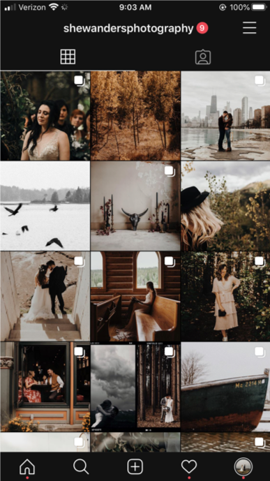
This is a screenshot of my current instagram grid:
Notice:
Brand colors are prominent (Burnt Orange, Shades of Green and Blue, etc.)
Black & white images
Photos of myself
Busy, full scene images
Mixed with simple closeups
Consistency (or at least my definition of it)
Photos of what I love to do/photograph (travel, weddings, portraits, nature)
This is all personal preference. Who am I to judge what does and does not make a successful Instagram account? Everyone expresses themselves differently, we all know that. These are just little indicators I use in finding a genuine account/instagram user/artist, and have applied to my own feed.
The list for what not to do is short.. because you, technically, can’t do Instagram wrong! I mean, I could list things I don’t like about what people post, but that’s not helpful, that’s judgemental. We all like different s*#t. The one thing I will say is a total turn-off is when things at too perfect. Or pretending to be perfect. I’m telling you, nobody likes cookie cutter when it comes to art. I used to think if my Instagram grid looked just like one of my favorite photographer’s Instagram grid I’d be set. I’d be successful and happy. 100% not the case. I’m going to go old school on you for this quote but it’s NECESSARY to remember: “Be yourself, everyone else is already taken.” I know I know I know it’s cheesy but for real, people are smarter than you think. I can smell ingenuity from a mile away, can’t you? We all get inspiration from someone, and that’s not a bad thing at all, but remember, Be inspired, but don’t copy! When I'm in an artistic slump I totally scroll through some of my favorite accounts to get inspiration. I’ll break down the two different options:
Option A) Finding inspiration through another photographer’s work, putting your twist on it, and possibly even mentioning who helped inspire the certain shoot/piece you just created and posted.
Option B) Finding inspiration through another photographer’s work, copying it exactly for how it is, claiming it as your own. BTW, this option makes you a copycat. Not inspirational. I used to do this to a certain extent when I first started, so I’m allowed to say that!
So much of this truly has to do with maturity. Notice how all my struggles usually began with “when I was younger, I did this” or “when I was first starting out, I thought that..” It takes time, growing up, and lots & lots of practice at the beginning. This doesn’t just go for your Instagram feed/theme… it goes for your brand as a whole. Let’s be real, making this much of a fuss over Instagram seems pretty silly. But, if you're an artist, it’s actually a pretty important tool for creating a successful brand. This is where we get to showcase our skills and what we’re passionate about. So we damn-well should be taking it (semi)seriously!
In conclusion:
Have fun with Instagram.
Follow some simple rules to show your consistency.
Don’t be afraid to get inspiration from someone else, but don’t be a lil copycat.
Let your personality shine through your photos and captions.
Be authentic.
Don’t worry about being perfect. We don’t like perfect. :)


